
How we boosted onboarding conversion by 150%

At Studio Pinto, we collaborated with the Figopara team with the aim of enhancing the conversion rate in their onboarding process. Our goal was to make the process self-service, thereby reducing customer support calls and facilitating business scalability. To identify areas of friction, usability issues, and user pain points within the process, we conducted both an expert review and user research using Figopara’s customers. The following sections detail the improvements we made based on these results.
The impact of our redesign has been substantial. The rate of visitors completing the first step of the application flow has seen a significant increase of 54%, and the rate of entering company information has also shown a notable growth of 63%. Furthermore, there has been an impressive 150% increase in the progression rate from the initial step to the end of the process for those individuals who have successfully completed the first step.
Let’s dive into the specific improvements we made:

1. Increasing Conversion
Shortened Registration
The process of getting users to register is crucial for a couple of key reasons:
Progress Saving: Given that onboarding to Figopara requires a minimum of five minutes, we wanted to ensure that users could save their progress and resume the process later if necessary.
Follow-up Communication: If a user churns for any reason, it’s important to be able to reconnect with them, either to re-engage them as a customer or to collect valuable feedback.
Previously, the registration process was a two-step procedure with 15 fields. We believed that registration should be as simple as possible, with the primary goal being to get qualified users to provide their contact information. This allows for ease of follow-up communication and encourages users to return to the process. Consequently, we reduced the registration form to just four fields: Name, Email, Phone, and Title. This significant simplification resulted in a four-fold increase in the conversion rate of registered users.
Unified Required Information
In the previous design, onboarding was broken down into two distinct steps. This resulted in users having to wait for verification twice, leading to an inefficient process both for the users and for Figopara. This lengthy waiting period was conducive to user churn; users would often not return after waiting, forget about the process, or opt to use another platform.
In response, we decided to combine all the steps required for onboarding into a single, streamlined process. This allows users to complete the onboarding in one sitting, fill out all necessary fields, and upload all the required documents for verification, resulting in a smoother and more efficient onboarding experience.
Unnecessary Information Elimination
We made a concerted effort to improve the onboarding process by eliminating unnecessary information, thereby making the form simpler and more intuitive. Here’s how we achieved this:
Transitioning to an E-Contract: One significant user challenge was the need to download, print, sign, and mail the contract. After researching the legal requirements, we transitioned to an electronic contract, allowing users to accept the terms with a simple tick of a box.
Reducing Document Requirements: The original process required users to upload seven documents, some of which needed to be sourced from their accountant. This often caused user churn, as the process had to be paused while they sought out these documents. By carefully reviewing the legal requirements, we managed to reduce the required number of documents from seven to three.
Eliminating Redundant Form Fields: We scrutinized each field we were asking users to fill and eliminated some, like the username (since users can use their email or tax ID to log in), and the company email address and phone number, which were unnecessary for confirming the legality of their company.

2. Improving Usability
Grouped Steps
To provide users with a clear indication of the number of steps required for onboarding, we categorized the necessary information into four distinct steps: registration, personal and company information, document upload, and invoice integrator connection.
This categorization sets clear expectations for the user, providing them with an idea of how many steps are involved and an estimate of the time commitment necessary. It also reduces the feeling of being overwhelmed. Breaking down the form into smaller, manageable steps can make it easier to use and understand. Users are less likely to make errors or overlook important fields when they are presented with one section at a time.
Indicating progress
Another usability improvement we implemented was the addition of a progress bar that fills up after each step. Progress bars are a highly effective usability tool. They provide users with instant feedback on how far they are in the process of filling out a form. This can help to keep users motivated and engaged, reducing the likelihood of frustration and form abandonment. The visual representation of progress can also help users feel more in control of the process.
Sticky action bar
To further enhance the usability of the form, we designed a sticky action bar at the bottom of the screen. This allows users to always access the most important actions, regardless of where they are on the page. Reducing the need for users to scroll back up or down the form to access important actions can significantly improve the efficiency of form completion. Sticky action bars also provide a consistent location for important actions, which can reduce cognitive load for users. Users don’t need to remember where important actions are located, as they are always in the same place. This feature can also help reduce errors by making it clear what the next step is and providing easy access to important actions.
Sticky action bars can be particularly beneficial for mobile users, as they provide easy access to important actions on a smaller screen. This can make the form-filling process more convenient and enjoyable for mobile users.
3. Fostering Confidence
Contextual help
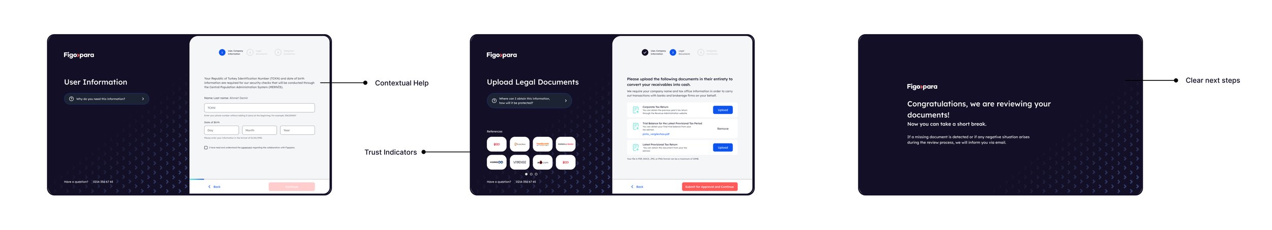
One of the findings from our usability testing was that users were often skeptical about providing their sensitive personal information. To help users overcome this skepticism, we added contextual help to fields such as ID number, birthdate, and company information. This provides users with clear explanations of why we need certain information and how we will protect it.
Another common issue was that users would either churn or call customer support when they got confused about what was being asked. To prevent this, we added the most frequently asked questions and their answers to each step, as well as contextual guidance. This ensures the user has all the information they need right in front of them, enabling them to complete the form independently.
Trust indicators
To foster trust, we used social proof, a common pattern that many websites use to gain users’ trust. Social proof can take the form of testimonials, logos of current customers, or social media posts. We incorporated this approach throughout the process to help users overcome their wariness about providing sensitive and important data. Testimonials from existing customers and logos of well-known companies were added to help establish trust and make users feel safe during the process.
Clear next steps
Finally, it’s important to note that most users come to Figopara because they need immediate cash. Therefore, they’re eager to sign up and start using the platform right away. In the past, we weren’t clear about what happens next after users complete the process, and how long they needed to wait. This lack of clarity often resulted in customer support calls from users wondering when they could get their credit line opened. In our redesign, we made it clear that we’ve obtained all the necessary information from them and we’ll notify them via email when the process is complete. This helps set their expectations correctly, reducing confusion and uncertainty.
In conclusion, the revamp of Figopara’s onboarding process demonstrates the impact of a thoughtful, user-centric approach to design. By simplifying the registration process, consolidating required information, enhancing usability, and building user trust, we were able to increase conversions and reduce customer support calls. This project underscores the importance of understanding the user journey and optimizing it for efficiency and ease of use, leading to improved business outcomes.